In almost every bigger mobile project at some point there comes the moment when you decide not to repeat boilerplate UI code but extract it into nice and reusable components.
In this article, I will present an example of an approach which allows creating a very flexible and maintainable solution.
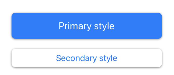
Once Upon a Time, there was a button.
Let’s start our journey with a story of a button - our designer decided about 2 visual styles that we need to implement in our product
Looks simple, let’s implement it.
class Custom1Button: UIButton {
    let blue = UIColor(red: 0/255.0, green: 122/255.0, blue: 255/255.0, alpha: 1)
    let darkerBlue = UIColor(red: 0/255.0, green: 98/255.0, blue: 250/255.0, alpha: 1)

    enum Style {
        case primary
        case secondary
    }

    private let style: Style

    init(
        frame: CGRect = .zero,
        style: Style
    ) {
        self.style = style
        super.init(frame: frame)
        setupStyle()
    }

    required init?(coder: NSCoder) {
        fatalError("init(coder:) has not been implemented")
    }

    private func setupStyle() {
        switch style {
        case .primary:
            setupPrimaryStyle()
        case .secondary:
            setupSecondaryStyle()
        }
        updateStyle()
    }

    private func updateStyle() {
        switch style {
        case .primary:
            updatePrimaryStyle()
        case .secondary:
            updateSecondaryStyle()
        }
    }

    override var isHighlighted: Bool {
        didSet {
            updateStyle()
        }
    }

    private func setupPrimaryStyle() {
        contentEdgeInsets = .init(top: 14, left: 20, bottom: 14, right: 20)

        self.layer.cornerRadius = 8

        setTitleColor(.white, for: .normal)
        titleLabel?.font = UIFont.preferredFont(forTextStyle: .title3)
    }

    private func setupSecondaryStyle() {
        contentEdgeInsets = .init(top: 8, left: 12, bottom: 8, right: 12)

        self.backgroundColor = .white

        self.layer.borderColor = blue.cgColor
        self.layer.borderWidth = 0
        self.layer.cornerRadius = 8

        setTitleColor(blue, for: .normal)
        setTitleColor(darkerBlue, for: .highlighted)
        titleLabel?.font = UIFont.preferredFont(forTextStyle: .body)
    }

    private func updatePrimaryStyle() {
        self.backgroundColor = isHighlighted ? darkerBlue : blue
        updateShadow()
    }

    private func updateSecondaryStyle() {
        updateShadow()
    }

    private func updateShadow() {
        layer.shadowColor = UIColor.black.cgColor
        layer.shadowOffset = CGSize(width: 0, height: isHighlighted ? 0 : 1)
        layer.shadowOpacity = 0.5
        layer.shadowRadius = 2
    }
}
I decided to use an enum defining component style and base on its value - apply different UI properties.
Future World
Let’s think for a moment about the future of our project. We know that the creative team is full of ideas. So we may expect many new styles and variants for the button.
Also hopefully with product growth at some point, we will introduce modularization. So we can also expect keeping this code in a specialized framework. Maybe even maintained by other developers.
Buttons in the applications are ubiquitous. So choices that we will make today will stay with us for a long time.
Right now our implementation is a mix of presentation (colours, shadows) and logic responsible for setting and changing it. Every new style increases the amount of code in the class and if/else/switch block. Also, every change introduces a risk of regression and bugs.
So let’s discuss what we can do differently to make this component better.
The first step is separation of presentation from the logic. We can do it by creating a struct with all changable UI parameters. If something depends on button state - use a closure and pass the required state.
struct Style {
    let backgroundColor: (_ isHighlighted: Bool, _ button: UIButton) -> Void
    let shadow: (_ isHighlighted: Bool, _ button: UIButton) -> Void
    let contentEdgeInsets: UIEdgeInsets
    let title: (_ button: UIButton) -> Void
    let border: (_ button: UIButton) -> Void
}
You can see that we have 2 types of properties - ones used only at initialization and others reacting on highlight state. We can group them in two functions
extension Style {
    func setup(button: UIButton) {
        title(button)
        border(button)
        button.contentEdgeInsets = contentEdgeInsets
        isHighlighted(button.isHighlighted, button: button)
    }

    func isHighlighted(_ value: Bool, button: UIButton) {
        backgroundColor(value, button)
        shadow(value, button)
    }
}
Before we continue with implementation let’s quickly add a few helpers.
extension Style {
    static func shadow(isHighlighted: Bool, view: UIView) {
        view.layer.shadowColor = UIColor.black.cgColor
        view.layer.shadowOffset = CGSize(width: 0, height: isHighlighted ? 0 : 1)
        view.layer.shadowOpacity = 0.5
        view.layer.shadowRadius = 2
    }

    static func defaultBorder(view: UIView) {
        view.layer.cornerRadius = 8
    }

    static let blue = UIColor(red: 0/255.0, green: 122/255.0, blue: 255/255.0, alpha: 1)
    static let darkerBlue = UIColor(red: 0/255.0, green: 98/255.0, blue: 250/255.0, alpha: 1)
}
Ok, so we have our style. Now let’s define styles from the initial design - the primary style for the start.
extension Style {
	static let primary = Style(
        backgroundColor: { isHighlighted, button in
            button.backgroundColor = isHighlighted ? Self.darkerBlue : Self.blue
        },
        shadow: Self.shadow(isHighlighted:view:),
        contentEdgeInsets: .init(top: 14, left: 20, bottom: 14, right: 20),
        title: {
            $0.setTitleColor(.white, for: .normal)
            $0.titleLabel?.font = UIFont.preferredFont(forTextStyle: .title3)
        },
        border: defaultBorder(view:)
    )
}
and then the secondary style
extension Style {
	static let secondary = Style(
        backgroundColor: { isHighlighted, button in
            button.backgroundColor = .white
        },
        shadow: Self.shadow(isHighlighted:view: ),
        contentEdgeInsets: .init(top: 8, left: 12, bottom: 8, right: 12),
        title: {
            $0.setTitleColor(blue, for: .normal)
            $0.setTitleColor(darkerBlue, for: .highlighted)
            $0.titleLabel?.font = UIFont.preferredFont(forTextStyle: .body)
        },
        border: defaultBorder(view:)
    )
}
Now we can easly see what contains the “style” for each button, what are the differences between them and what is shared.
Ok, it’s time to implement our UIButton subclass.
After removing most of the “presentation” code from the first implementation, the class logic looks much simpler and cleaner.
 class Custom2Button: UIButton {
    private let style: Style

    init(
        frame: CGRect = .zero,
        style: Style
    ) {
        self.style = style
        super.init(frame: frame)
        style.setup(button: self)
    }

    required init?(coder: NSCoder) {
        fatalError("init(coder:) has not been implemented")
    }

    override var isHighlighted: Bool {
        didSet {
            style.isHighlighted(isHighlighted, button: self)
        }
    }
}
This is promising.
For comparison let’s see how this solution compares with the initial approach. For purpose of this evaluation we will be implementing a new much different visual style - “a link”.

With the monolith component, we need to add new methods
private func updateLinkStyle() {
// ...
}

private func setupLinkStyle() {
// ...
}
Then we need to update Style enum and code in switch statment in updateStyle and setupStyle methods.
It’s 5 places when we need to change/add something to the UIButton subclass.
Using Style struct we need only one change - define the new static property in the extension
extension Style {
    static let link = Style(
        backgroundColor: { isHighlighted, button in
            button.backgroundColor = .clear
        },
        shadow: { _,_ in },
        contentEdgeInsets: .init(top: 8, left: 12, bottom: 8, right: 12),
        title: {
            $0.setTitleColor(blue, for: .normal)
            $0.setTitleColor(darkerBlue, for: .highlighted)
            $0.titleLabel?.font = UIFont.preferredFont(forTextStyle: .body)
        },
        border: { _ in }
    )
}
Summary
As you can see with relatively simple refactoring we were able to make flexible and easy to extend component. With this approach, we can place our button in a framework and define styles in the main target or create a new private style only for a specific use case.
This is an example of Open-Closed Principle used in practice - “Software entities should be open for extension, but closed for modification.”
Sidenote
Why I’ve decided to use separate properties and not put everything into 2 methods / closures (setup & isHighlighted)?
Properties graduation helps to build more flexible and reusable struct. We can put the reusable code into a pure static function (for example func shadow) and reuse it. Another advantage - provide names for blocks of code which helps to read and understand code.